Monday, November 18, 2013

Why should you attend a crop at the Latham Michael's?

Lots of great reasons but the free double page layout from me is a bonus for sure.  I used to only offer a free kit on the official Scrap In days (first Saturday of the month) but since that class may begin closing out and I'd love to have the same thing happen on the unofficial day (third Sunday of the month), I'm going to offer a free kit at both crops, with only one kit per customer per month.

So for the second November crop and either December crop you will get one of three of these kits from a wonderful Simple Stories paper pack we are carrying this season.  Check it out.

 Kit one page one and two


Kit two page one and two


Kit three page one and two


November Scrapbook class

For those that don't know, I still offer a Sketched Out class version on the Scrapbooking 101 night. You can get two double page layout kits to make that night and this month I LOVE the pages.  I'm always a big fan of Bo Bunny papers and last year's Apple Cider papers were gorgeous.  See what the November kits made.


This is a great example of how to build on papers what a full page image.  I cut out the scarecrow and wheelbarrow, put a piece of solid brown behind that corner, and lifted the cut image with foam tape to add some dimension.  For a little shine, I painted some leaves and acorn tops with pearlized Smooch, and added some bling along page where the swirls met on the paper.  Bo Bunny took care of the color and pattern for me.  The paper had plenty of fun pieces to cut and pop up.  Picture don't do these papers justice.  Stop by the Latham Michael's to see them in the book.

Thanks for checking out these layouts.

Tuesday, October 1, 2013

Card Tricks-Happy Halloween

Great class tonight with a fantastic group of crafty ladies.  The surprise was that a class of three turned into a class of eight and I didn't have eight kits.  But we shifted some things and the ladies were very flexible.  Here are the fun and easy cards.

First up is a super cute stamp from Hampton Arts made by Outlines.  I'm so happy Outlines stamps are still available. Love their designs.  I knew this would be fun to color with some Copic markers.  We added some rock candy distress stickles to the stars on the owl's hat.  The 'trick or treat' is cut from a ribbon.  An easy way to add some texture and shine to a card.  The bat paper is textured with glitter and the purple paper is from DeNami, rich with texture.


Next up is a super simple card because the paper are so fabulous.  This is Graphic 45's Happy Haunting.  The paper comes with five imprints of this image and four of another Halloween post card.  We added a Martha Stewart glittered spider over the spider in the image and a Halloween themed ribbon.


This card used another great image we got at the store and I knew right away I wanted to use this image.  We masked the raven and sprayed Bronze Perfect Pearls spray.  After drying the stain, we reverse masked the raven and used a lighter Perfect Pearls spray.   The image is layered on plain and print papers and another snippet of Halloween ribbon, this time 'Magic'.


Last card, this time using a black Recollections card with a die cut circle and embossed border.  We punched a larger circle of Halloween print paper then layered a punched image of a witch and her cauldron punched from silver glitter paper.  She's on the inside of the card and you can view this piece through the circle.  Then we cut some potion bottles from Martha Stewart papers and added them with a perfect phrase "Bubble, Bubble, Toil and Trouble"


More great classes coming to the Latham Michael's:  three Christmas themed cards, Spellbinders card tricks and November's Card Tricks class which will be Thanksgiving and Fall themed.  Hope to see you there.  I'll be making extra kits for sure.

Saturday, September 21, 2013

Kick It!

This was a fun page to make, but there is a glaring mistake.  Can you find it?  This paper was something I got in a packet of misc. stuff from SEI at the Creative Keepsakes Convention last year.  There were pages for every sport.

This is a great example of papers that are so rich and interesting and I don't want to cover it up.  I wanted to limit the amount of materials put on top.  The title, player, and soccer balls are cut from the Cricut Sports Mania cartridge.  The number 10 came from an SEI sticker sheet that came with this packet.  I made corner mats with the white soccer paper and punched a scalloped edge for one photo mat.


So did you find the mistake?  I cut the soccer balls with the white and black papers backwards.    Ready to add the team and individual photos.  Score!

Dinos Roar! A Sketched Out layout

The photo of this layout doesn't do it justice because the paper is shiny and textured and the other papers are more patterned than they appear. The dinosaurs are cut with the Cricut and the Dinosaur Tracks cartridge.


After the pictures were taken I thought it needed more texture and added some burlap.  I wanted texture and more embellishments but I don't like using things like buttons or ribbons on a boy themed page.  I do like eyelets and brads on boy pages and I'm open to any suggestions for ways to add to this page. 


July Scrap In layout

This was a layout that used a bunch of different things.  I love Basic Grey paper and Michael's had a collection on the sale rack that I bought for this purpose.  The chevron cuts were made using Kiwi Lane templates.  The alphabet letters, the 'of, and the 'joy' were cut from a patterned paper and the phrase is cut from a Quick Quotes paper.  Then I added lots of buttons and some brads.

When I saw this layout from Michael's I originally thought I'd have to buy materials but I have so much stuff I was determined to use what I had.  I'm happy the way it came out.  It's a perfect way to enhance some family pictures.


April Scrap In layout

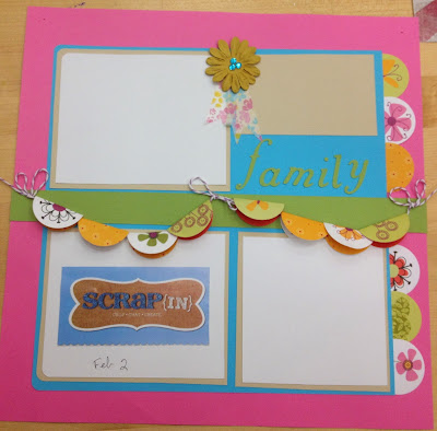
This is the April Scrap In layout which is based a layout from Michael's.  Every month at the Scrap In you get a flyer with a sample page layout.  At the Latham store, you get a double page layout as a gift from me.  This is an older paper line from SEI.

I added some twine, some washi tape, paper flowers, some rhinestones, and some Cricut cut word.  The  circles were all punched from patterned paper.

Easy way to use some scraps of a paper you love, but don't have a lot of.  And we all have LOTS of scraps, right?